Python Code Snippets
Download Code
Data Understanding in Python
Histograms
Book reference: Chapter 4.3.1, page 40Histograms are generated by the hist function in the matplotlib library. Here, we use the Iris data set, available as part of the Scikit-learn (sklearn) library, a library of machine learning functions.
import numpy as np
import pandas as pd
import matplotlib.pyplot as plt
from sklearn import datasets

# loading the iris data set
iris = datasets.load_iris()
X = pd.DataFrame(iris.data)   # features data frame
X.columns = ['sepal length', 'sepal width', 'petal length', 'petal width']
y = pd.DataFrame(iris.target)  # target data frame
y.columns = ['species']
target_names = iris.target_names
The data set has been read into a data frame object X, a class of object available in the pandas library. In addition, the target describing different species is stored in another data frame y. The feature names have been assigned to this data frame as column names. We generate a histogram of the petal length with the following code.
# histogram of the petal length
plt.hist(X['petal length'])
plt.show()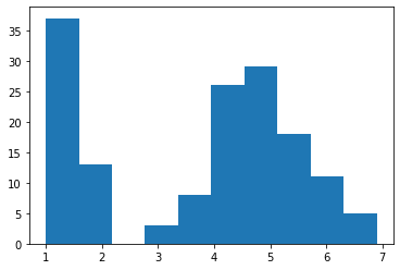
Note that you need to run plt.show() to display the figure on your screen. You may notice that the histogram includes only a small number of bars, despite the large amount of data! You can change the number of bins, or the number of bars on a histogram by the second parameter.
# histogram with 20 bins
plt.hist(X['petal length'], 20)
plt.show()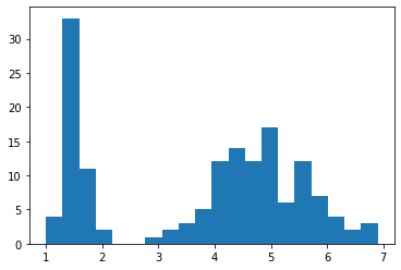
Boxplots
Book reference: Chapter 4.3.1, page 43Boxplots can be generated by the boxplot method associated with data frame objects in pandas. You can specify a particular feature with the columns parameter. Here is a boxplot of the the petal length from the Iris data set.
# box plot of the petal length
X.boxplot(column='petal length')
plt.show()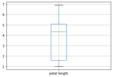
Or, we can generate boxplots of the petal length and width.
# box plot of the petal length & width
X.boxplot(column=['petal length', 'petal width'])
plt.show()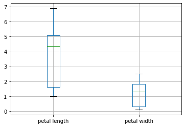
Or all the features in the data set.
# box plot of all the features
X.boxplot()
plt.show()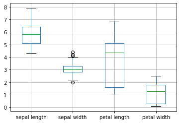
We can generate boxplots with notches by specifying the option notch=True.
# notched box boxplots
X.boxplot(notch=True)
plt.show()
Finally, the describe method, associated with a data frame objects, produces various descriptive statistics (mean, median, quartiles, etc.) for each column.
# describing various statsitics
print(X.describe())
sepal length sepal width petal length petal width count 150.000000 150.000000 150.000000 150.000000 mean 5.843333 3.057333 3.758000 1.199333 std 0.828066 0.435866 1.765298 0.762238 min 4.300000 2.000000 1.000000 0.100000 25% 5.100000 2.800000 1.600000 0.300000 50% 5.800000 3.000000 4.350000 1.300000 75% 6.400000 3.300000 5.100000 1.800000 max 7.900000 4.400000 6.900000 2.500000
Scatter Plots
Book reference: Chapter 4.3.1, page 45Scatter plots can be generated by the plot.scatter method associated with data frame objects in pandas. You can specify the columns represented in the x- and y-axes with parameters x and y, respectively. As an example, we plot the petal width against the petal length.
# plotting petal width vs length (as a method)
X.plot.scatter(x='petal width', y='petal length')
plt.show()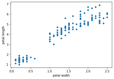
Alternatively, we can produce a scatter plot using the scatter function as part of the matplotlib.pyplot library. A scatter plot of the petal width v.s. length is produced with the plot function.
# plotting petal width vs length (as a function)
plt.scatter(X['petal width'], X['petal length'])
plt.show()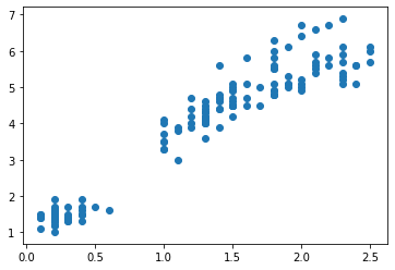
All features can be plotted against each other with the plotting.scatter_matrix method associated with a data frame object. Here, all features in the Iris data are plotted in a scatter plot matrix.
# scatter plot matrix
pd.plotting.scatter_matrix(X)
plt.show()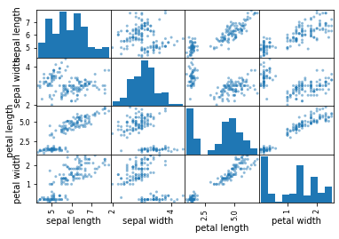
Notice that all data points are plotted in the same color. However, you may want to plot data points corresponding to different species in different colors. To do so, we provide the information on species contained in the data frame column y['species'] to the parameter c in the plotting.scatter_matrix method.
# scatter plot matrix with different colors for species
pd.plotting.scatter_matrix(X, c=y['species'])
plt.show()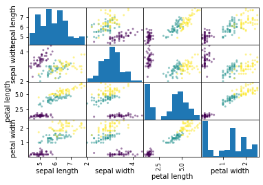
Principal Component Analysis
Book reference: Chapter 4.3.2.1, page 48In Scikit-learn, a Python library for machine learning tools, many algorithms are implemented as objects, rather than functions. In a nutshell, an object is a combination of data, a collection of functions associated with the data (referred as methods), as well as the properties of the object (referred as attributes). To demonstrate this idea, we apply a z-score transformation, or normalize, the Iris data in preparation for a principal component analysis. In particular, we create a normalization object available as a StandardScaler object under the sklearn.preprocessing library.
from sklearn.preprocessing import StandardScaler

# defining an normalization object
normData = StandardScaler()
Next, we fit the feature data X to this newly defined normalization transformation object normData, with the fit method.
# fitting the data to the normalization object
normData.fit(X)
StandardScaler(copy=True, with_mean=True, with_std=True)
Now the normalization object is ready, meaning that means and standard deviations have been calculated for each feature in the provided data set. Now we apply the actual transformation by the transform method to transform the data set X. The resulting normalized features are stored in X_norm.
# applying the normalization transformation to the data
X_norm = normData.transform(X)
To perform these processes, you can also use the fit_transform method, which is a combination of the fit and transform methods performed at once.
X_norm = StandardScaler().fit_transform(X)Now we apply PCA to the normalized data X_norm. This is done by creating a PCA transformation object, available as part of the sklearn.decomposition library. Then performing the fit_transform method to calculate principal components.
from sklearn.decomposition import PCA

# applying PCA
pca = PCA()  # creating a PCA transformation ojbect
X_pc = pca.fit_transform(X_norm) # fit the data, and get PCs
This produces an array X_pc with 150 rows and 4 columns (corresponding to 4 PCs).
X_pc.shape(150, 4)
The attribute explained_variance_ratio_ stores the amount of variability in the data explained by each PC. The first PC explains 73% of variability, whereas the second PC explains 23% of variability, and so on.
# proportion of the variance explained
print(pca.explained_variance_ratio_)
[0.72962445 0.22850762 0.03668922 0.00517871]
We plot the first 2 PCs, representing the four original features in a 2D space. The first PC (or the first column of X_pc, X_pc[:,0]) is plotted on the x-axis and the second PC (or the second column of X_pc, X_pc[:,1]) is plotted on the y-axis.
# plotting the first 2 principal compnonents
plt.scatter(X_pc[:,0], X_pc[:,1], c=y['species'])
plt.show()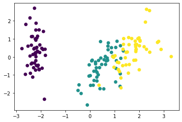
Multidimensional Scaling
Book reference: Chapter 4.3.2.3, page 53Multi-dimensional scaling is implemented as an MDS transformation object available in the sklearn.manifold library. Here, we define a transformation object mds, then use the fit_transfrom method to obtain the MDS-transformed coordinates as X_mds.
from sklearn.manifold import MDS

# applying MDS
mds = MDS()
X_mds = mds.fit_transform(X_norm)
By default, the MDS transformation maps a higher-dimension space to a 2D space. We plot the transformation results in 2D.
# plotting the MDS-transformed coordinates
plt.scatter(X_mds[:,0], X_mds[:,1], c=y['species'])
plt.show()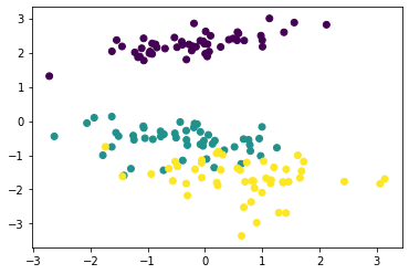
Parallel Coordinates, Radar, and Star Plots
Book reference: Chapter 4.3.2.6-7, page 59A parallel coordinates plot can be generated by the plotting.parallel_coordinates function available in the Pandas library. This function assumes that features and labels are stored in a same data frame. Thus, first we combine the feature data frame X and the target label data frame y with the concat function in Pandas. The resulting combined data frame Xy is then used in the parallel coordinates plot.
Xy = pd.concat([X,y], axis=1)
pd.plotting.parallel_coordinates(Xy,'species')
plt.show()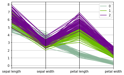
Correlations
Book reference: Chapter 4.4, page 62The Pearson, Spearman, and Kendall correlations can be calculated by the pearsonr, spearmanr, and kendalltau function available in the SciPy (scientific Python) library, respectively. These functions return the correlation value and the associated p-value (of testing whether the correlation is zero).
import scipy as sp

r_pearson, p_pearson = sp.stats.pearsonr(X['sepal length'], X['sepal width'])
r_spearman, p_spearman = sp.stats.spearmanr(X['sepal length'], X['sepal width'])
r_kendall, p_kendall = sp.stats.kendalltau(X['sepal length'], X['sepal width'])
The resulting correlation values are:
r_pearson-0.11756978413300208
r_spearman-0.166777658283235
r_kendall-0.0769967881165167
Validation in Python
Training and Testing data
Book reference: Chapter 5.5.1, page 112In this example, we will use the Iris data as used in the previous chapter. The features and the target are loaded into arrays named X and y, respectively.
import numpy as np
from sklearn import datasets
from sklearn.model_selection import train_test_split
from sklearn.naive_bayes import GaussianNB
from sklearn.metrics import confusion_matrix, classification_report

# Loading the iris data
iris = datasets.load_iris()
X = iris.data  # array for the features
y = iris.target  # array for the target
feature_names = iris.feature_names   # feature names
target_names = iris.target_names   # target names
Here, we split the Iris data into the training data set (comprising 2/3 of all observations) and the testing data set (comprising the remaining 1/3 of all observations). This is done by the train_test_split function available in the sklearn.model_selection library. This function takes an feature array and a target array as input parameters, and split them into training and testing data sets. In this example, the input features and targets, X and y respectively, are split into the training set (X_train for the features, and y_train for the target) as well as the testing data (likewise X_test and y_test).
# spliting the data into training and testing data sets
X_train, X_test, y_train, y_test = train_test_split(X, y, test_size=0.333,
                                            random_state=2020)
Here, the parameter test_size specifies the proportion of the original data to be assigned to the testing data. The order of observations are randomized in both training and testing data.
y # original target labelsarray([0, 0, 0, 0, 0, 0, 0, 0, 0, 0, 0, 0, 0, 0, 0, 0, 0, 0, 0, 0, 0, 0,
0, 0, 0, 0, 0, 0, 0, 0, 0, 0, 0, 0, 0, 0, 0, 0, 0, 0, 0, 0, 0, 0,
0, 0, 0, 0, 0, 0, 1, 1, 1, 1, 1, 1, 1, 1, 1, 1, 1, 1, 1, 1, 1, 1,
1, 1, 1, 1, 1, 1, 1, 1, 1, 1, 1, 1, 1, 1, 1, 1, 1, 1, 1, 1, 1, 1,
1, 1, 1, 1, 1, 1, 1, 1, 1, 1, 1, 1, 2, 2, 2, 2, 2, 2, 2, 2, 2, 2,
2, 2, 2, 2, 2, 2, 2, 2, 2, 2, 2, 2, 2, 2, 2, 2, 2, 2, 2, 2, 2, 2,
2, 2, 2, 2, 2, 2, 2, 2, 2, 2, 2, 2, 2, 2, 2, 2, 2, 2])
y_train # training data target labelsarray([0, 2, 1, 0, 1, 1, 2, 1, 0, 1, 0, 0, 0, 1, 1, 1, 0, 0, 2, 1, 2, 0,
0, 2, 0, 2, 2, 0, 2, 0, 0, 1, 0, 0, 2, 1, 0, 2, 1, 2, 0, 2, 2, 0,
1, 2, 0, 2, 1, 1, 2, 1, 0, 2, 1, 0, 1, 1, 1, 2, 1, 0, 2, 0, 0, 1,
2, 2, 2, 1, 2, 1, 0, 2, 0, 1, 0, 0, 1, 1, 2, 1, 2, 0, 2, 1, 2, 2,
1, 2, 0, 0, 1, 2, 2, 1, 2, 1, 2, 1])
y_test # testing data target labelsarray([2, 0, 1, 1, 1, 2, 2, 1, 0, 0, 2, 2, 0, 2, 2, 0, 1, 1, 2, 0, 0, 2,
1, 0, 2, 1, 1, 1, 0, 0, 2, 0, 0, 0, 2, 0, 0, 1, 0, 2, 0, 2, 1, 0,
1, 2, 2, 1, 1, 1])
The parameter random_state is used to seed (or initialize) the random number generator. It is not a required parameter, but if you want to re-create the same random split, they you can use the same value for the random_state.
Classifier training and prediction
In this example, we train a naive Bayes classifier for the Iris data, and evaluate its performance. We use a Gaussian naive Bayes classifier object GaussianNB available in the sklearn.naive_bayes library. We define the classifier object as gnb. The classifier object is trained with the training data (both features X_train and target y_train) using the fit method. Once the classifier gnb is trained, then it is used to predict target labels based on the testing data features X_test. The predicted labels are stored in y_pred.
# Gaussian naive Bayes classifier
gnb = GaussianNB()  # defining the classifier object
gnb.fit(X_train, y_train)  # training the classifier with the training set
y_pred = gnb.predict(X_test)  # generating prediction with trained classifier
Now we examine the performance of the classifier by generating a confusion matrix. This is done by the confusion_matrix function available in the sklearn.metrics library. Here, we need to provide the true target labels y_test as well as the predicted labels y_pred.
# confusion matrix
print(confusion_matrix(y_test,y_pred))
[[18 0 0] [ 0 14 2] [ 0 3 13]]
As you see, there are some misclassifications in the 2nd and 3rd classes (versicolors and virginicas). We can also generate other measures of model performance with the classification_report function under the sklearn.metrics library. This function also takes arrays of target labels for the truth and the predicted. We also provide the list of target class names stored in target_names to the parameter target_names so that the output table has row headings corresponding to different target classes.
# classification report
print(classification_report(y_test, y_pred, target_names=target_names))
precision recall f1-score support
setosa 1.00 1.00 1.00 18
versicolor 0.82 0.88 0.85 16
virginica 0.87 0.81 0.84 16
accuracy 0.90 50
macro avg 0.90 0.90 0.90 50
weighted avg 0.90 0.90 0.90 50
Data Preparation in Python
Missing Values
Book reference: Chapter 6.2.2, page 137If we can assume that missing values occur missing completely at random (MCAR), then we can use a number of imputation strategies available in the sklearn library. To demonstrate, we create some toy data sets.
import numpy as np
import pandas as pd
from sklearn.impute import SimpleImputer

# Creating toy data sets (numerical)
X_train = pd.DataFrame()
X_train['X'] = [3, 2, 1, 4, 5, np.nan, np.nan, 5, 2]
X_test = pd.DataFrame()
X_test['X'] = [3, np.nan, np.nan]
Here, we created data frames X_train and X_test, both containing a numerical data column X. There are some missing values in these data sets, defined by np.nan, a missing value available in the numpy library. If we examine these data frames, the missing values are indicated by NaN.
X_trainX 0 3.0 1 2.0 2 1.0 3 4.0 4 5.0 5 NaN 6 NaN 7 5.0 8 2.0
X_testX 0 3.0 1 NaN 2 NaN
We also created data frames S_train and S_test with a string column, with some missing values indicated by np.nan.
# Creating toy data sets (categorical)
S_train = pd.DataFrame()
S_train['S'] = ['Hi', 'Med', 'Med', 'Hi', 'Low', 'Med', np.nan, 'Med', 'Hi']
S_test = pd.DataFrame()
S_test['S'] = [np.nan, np.nan, 'Low']S_trainS 0 Hi 1 Med 2 Med 3 Hi 4 Low 5 Med 6 NaN 7 Med 8 Hi
S_testS 0 NaN 1 NaN 2 Low
We impute missing values by creating a simple imputation object SimpleImputer available in the sklearn.impute library. We define a numerical imputation object imp_mean as
imp_mean = SimpleImputer(missing_values=np.nan, strategy='mean')Here, the parameter missing_values defines which value is considered as missing. The parameter strategy defines the imputation method. In this example, we use 'mean', meaning that the mean of all non-missing values will be imputed. We use the fit_transform method and provide the X_train data to calculate the mean to be imputed, in addition to actually imputing missing values.
X_train_imp = imp_mean.fit_transform(X_train)X_train_imparray([[3. ],
[2. ],
[1. ],
[4. ],
[5. ],
[3.14285714],
[3.14285714],
[5. ],
[2. ]])
As you can see, missing values are imputed by the mean. We can apply this imputation strategy (with the mean calculated on the training data) to the second data X_test by the transform method.
X_test_imp = imp_mean.transform(X_test)X_test_imparray([[3. ],
[3.14285714],
[3.14285714]])
For categorical or string data, we can impute most frequent value by specifying the parameter strategy to 'most-frequent' in the SimpleImputer object. Here, we define the imputation object imp_mode imputing the most frequent category from the S_train data to both S_train and S_test data sets.
# Imputing categorical data with mode
imp_mode = SimpleImputer(missing_values=np.nan, strategy='most_frequent')
S_train_imp = imp_mode.fit_transform(S_train)
S_test_imp = imp_mode.transform(S_test)S_train_imparray([['Hi'],
['Med'],
['Med'],
['Hi'],
['Low'],
['Med'],
['Med'],
['Med'],
['Hi']], dtype=object)
S_test_imparray([['Med'],
['Med'],
['Low']], dtype=object)
Normalization and Scaling
Book reference: Chapter 6.6.3, page 153For this example, we shall use the Iris data set again. We load the Iris data and split to training and testing data, with the testing data comprising 1/3 of all observations.
from sklearn import datasets
from sklearn.preprocessing import StandardScaler, MinMaxScaler
from sklearn.model_selection import train_test_split

# loading the Iris data
iris = datasets.load_iris()
X = iris.data  # array for the features
y = iris.target  # array for the target
feature_names = iris.feature_names   # feature names
target_names = iris.target_names   # target names

# spliting the data into training and testing data sets
X_train, X_test, y_train, y_test = train_test_split(X, y, test_size=0.333,
                                                    random_state=2020)
We can normalize the data to Z-scores using the StandardScaler transformation object, as we have seen in a previous chapter. The transformation object is trained with the testing data X_train with the fit_transform method. Then the trained transformation is applied to the testing data with the transformation method.
# z-score normalization
normZ = StandardScaler()
X_train_Z = normZ.fit_transform(X_train)
X_test_Z = normZ.transform(X_test)
The resulting means and standard deviations for the normalized training data set are:
X_train_Z.mean(axis=0)array([-2.17187379e-15, 1.35447209e-16, 1.24344979e-16, 2.19407825e-16])
X_train_Z.std(axis=0)array([1., 1., 1., 1.])
Likewise, the means and standard deviations of the normalized testing data set are:
X_test_Z.mean(axis=0)array([-0.17055031, -0.10396525, -0.10087131, -0.04575343])
X_test_Z.std(axis=0)array([0.94189599, 0.8734677 , 1.00463184, 0.97844516])
To apply a min-max scaling, thus scaling all features in the [0, 1] interval, we can use the MinMaxScaler object available in the sklearn.preprocessing library.
# min-max normalization
normMinMax = MinMaxScaler()
X_train_MinMax = normMinMax.fit_transform(X_train)
X_test_MinMax = normMinMax.transform(X_test)
Let's examine the minimum and the maximum of the normalized training data.
X_train_MinMax.min(axis=0)array([0., 0., 0., 0.])
X_train_MinMax.max(axis=0)array([1., 1., 1., 1.])
Likewise, the minimum and the maximum of the normalized testing data. It should be noted that the minimum and the maximum used in the transformation were determined based on the training data. Thus there is no guarantee that the minimum and the maximum fall within the interval [0, 1].
X_test_MinMax.max(axis=0)array([0.02777778, 0.08333333, 0.03389831, 0.04166667])
X_test_MinMax.max(axis=0)array([0.94444444, 0.75 , 0.96610169, 1. ])
Finding Patterns in Python
Hierarchical Clustering
Book reference: Chapter 7.1, page 159In this example, we apply hierarchical clustering to the Iris data. The data is first normalized with the StandardScaler object.
import numpy as np
import matplotlib.pyplot as plt
from sklearn import datasets
from sklearn.preprocessing import StandardScaler
from sklearn.cluster import AgglomerativeClustering, KMeans, DBSCAN

# Loading the iris data
iris = datasets.load_iris()
X = iris.data  # array for the features
y = iris.target  # array for the target
feature_names = iris.feature_names   # feature names
target_names = iris.target_names   # target names

# z-score normalization using fit_transform method
X_norm = StandardScaler().fit_transform(X)
Then the hierarchical clustering is implemented as an AgglomerativeClustering object available in the sklearn.cluster library. We set the number of clusters to 3 by setting the n_clusters parameter. We use the Ward method for linkage calculation by setting the linkage parameter.
# Hierarchical clustering
hc = AgglomerativeClustering(n_clusters=3, linkage='ward')
Then we learn from the normalized data X_norm by using the fit method associated with the clustering object hc. The resulting cluster assignments are stored in the attribute labels_ of the transformation object hc. We store this information in the array y_clus.
hc.fit(X_norm)  # actually fitting the data
y_clus = hc.labels_   # clustering info resulting from hierarchical
We visualize the resulting clusters with a scatter plot, plotting the sepal length on the x-axis and the petal width on the y-axis. Different clusters are indicated by different colors.
# Plotting the clusters
plt.scatter(X_norm[:,3],X_norm[:,0],c=y_clus,marker='+')
plt.show()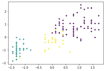
Next, we generate a
dendrogram
describing distances between different clusters. To do so, we use thelinkage function to calculate distances between observations, and the dendrogram function to plot the actual dendrogram. Both functions are available in the scipy.cluster.hierarchy library. In the linkage function, we provide the normalized features X_norm and the linkage method ward (for the Ward method). The resulting distance matrix D is then used in the dendrogram function.
from scipy.cluster.hierarchy import dendrogram, linkage

D = linkage(X_norm, 'ward')
dn = dendrogram(D)
plt.show()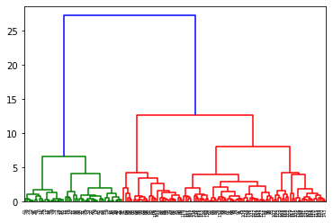
K-means clustering
Book reference: Chapter 7.3.2.1, page 175K-means clustering is implemented as the KMeans transformation object available in the sklearn.cluster library. We define the clustering object km with the number of clusters n_clusters=3. We learn from the normalized data X_norm, and store the resulting cluster assignment information in the array y_clus.
# K-means clustering
km = KMeans(n_clusters=3)  # defining the clustering object
km.fit(X)  # actually fitting the data
y_clus = km.labels_   # clustering info resulting from K-means
As before, we plot the normalized sepal length (x-axis) vs the normalized petal width (y-axis), with different clusters indicated by different colors.
# Plotting the clusters
plt.scatter(X_norm[:,3],X_norm[:,0],c=y_clus,marker='+')
plt.show()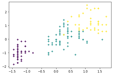
As in many clustering algorithms, you have to specify the number of clusters K in the k-means clustering method. What can we do if we do not know the number of clusters beforehand? One way we can determine the number of clusters is to plot the sum of squared distances from cluster centroids (i.e., how far observations are from the centrolids), also known as the inertia. We can get the inertia from k-means clustering by the attribute inertia_.
We run the K-means algorithm with different numbers of clusters, and calculate the corresponding inertiae. Then we plot the inertiae against the number of clusters. The inertia decreases as the number of clusters increases. However, there is an elbow in this plot where the rate of decrease slows down. In this particular example, we calculate the inertia up to 20 clusters.
SSE = []
for iClus in range(1,21):
    # K-means clustering
    km = KMeans(n_clusters=iClus)  # K-means with a given number of clusters
    km.fit(X_norm)  # fitting the principal components
    SSE.append(km.inertia_) # recording the sum of square distances
In brief, we use a for loop to run k-means clustering with k=1 to 20 clusters. With for each value of k, we record the corresponding inertia and store in a list SSE. Then we plot k (number of clusters, x-axis) against the inertiae (y-axis).
# plotting the sum of square distance (a.k.a., inertia)
plt.plot(np.arange(1,21),SSE,marker = "o")
plt.xlabel('Number of clusters')
plt.ylabel('Inertia')
plt.show()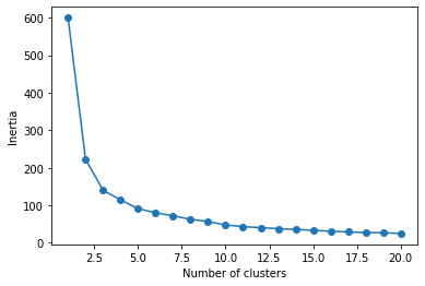
In the plot, the rate of decrease seems to slow down (i.e., the elbow) at k=3. It should be noted that this elbow method is somewhat subjective; someone can easily choose k=2 or k=4 as the elbow. Moreover, this method requires repeating k-means clustering many times, which may not be possible for large data.
DBSCAN clustering
Book reference: Chapter 7.4, page 181DBSCAN clustering is implemented as the DBSCAN transformation object available in the sklearn.cluster library. We define the clustering object dbscan, and we learn from the normalized data X_norm, and store the resulting cluster assignment information in the array y_clus. In addition, the indices for core points are available as the attribute core_sample_indices_ so we store that information in „code.
# DBSCAN clustering
dbscan = DBSCAN()  # defining the clustering object
dbscan.fit(X_norm)  # fitting the data
y_clus = dbscan.labels_   # cluster labels
indCore = dbscan.core_sample_indices_   # indices of core points
As before, we plot the normalized sepal length (x-axis) vs the normalized petal width (y-axis), with different clusters indicated by different colors. A cluster index of -1 corresponds to a noise points, whereas all the other indices are integers corresponding to different clusters. In the plot, core points are plotted with larger markers, and noise points are plotted in red.
# plotting non-noise points
plt.scatter(X_norm[y_clus>0,3],X_norm[y_clus>0,0], c=y_clus[y_clus>0],
            marker='o', s=10)
# plotting core points
plt.scatter(X_norm[indCore,3], X_norm[indCore,0],c=y_clus[indCore],
            marker='o', s=100)
# plotting noise points
plt.scatter(X_norm[y_clus==-1,3],X_norm[y_clus==-1,0], c='r',
            marker='o', s=10)
plt.show()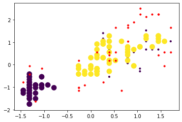
Finding Explanations
Decision tree
Book reference: Chapter 8.1, page 220In this example, we will construct a decision tree for the Iris data. First, we load the data set as before, and split it into the training (N=100) and testing (N=50) data sets.
import numpy as np
import matplotlib.pyplot as plt
from sklearn.datasets import load_iris
from sklearn.tree import DecisionTreeClassifier, plot_tree
from sklearn.model_selection import train_test_split
from sklearn.metrics import confusion_matrix, classification_report

# Loading data
iris = load_iris()
X = iris.data
y = iris.target
feature_names = iris.feature_names
target_names = iris.target_names

# spliting the data into training and testing data sets
X_train, X_test, y_train, y_test = train_test_split(X, y, test_size=50,
                                                    random_state=2020)
Next, we define a decision tree classification object DecisionTreeClassifier available under the sklearn.tree library. As we define the classifier object dt, we use the entropy criterion (criterion='entropy') to describe sample inhomogeneity at each node. We also set the minimum leaf size min_samples_leaf to 3 and the maximum tree depth max_depth to 4 in order to avoid overfitting. We seed the random number generator for this algorithm with the random seed random_state=0.
# decision tree classifier
dt = DecisionTreeClassifier(criterion='entropy',
                            min_samples_leaf = 3,
                            max_depth = 4,
                            random_state=0)
Then we train he classifier with the fit method.
dt.fit(X_train,y_train)DecisionTreeClassifier(ccp_alpha=0.0, class_weight=None, criterion='entropy',
max_depth=4, max_features=None, max_leaf_nodes=None,
min_impurity_decrease=0.0, min_impurity_split=None,
min_samples_leaf=3, min_samples_split=2,
min_weight_fraction_leaf=0.0, presort='deprecated',
random_state=0, splitter='best')
The trained classifier is then used to generate prediction on the testing data.
# classification on the testing data set
y_pred = dt.predict(X_test)
The confusion matrix and the classification report are generated.
print(confusion_matrix(y_test,y_pred))[[18 0 0] [ 0 14 2] [ 0 1 15]]
print(classification_report(y_test, y_pred,
                            target_names=target_names))
precision recall f1-score support
setosa 1.00 1.00 1.00 18
versicolor 0.93 0.88 0.90 16
virginica 0.88 0.94 0.91 16
accuracy 0.94 50
macro avg 0.94 0.94 0.94 50
weighted avg 0.94 0.94 0.94 50
The resulting decision tree can be visualized by the plot_tree function available in the sklearn.tree library. The trained classifier is passed on as the required input parameter, along with the feature names and class names.
# plotting the tree
plt.figure(figsize=[7.5,7.5])
plot_tree(dt, feature_names=feature_names, class_names=target_names)
plt.show()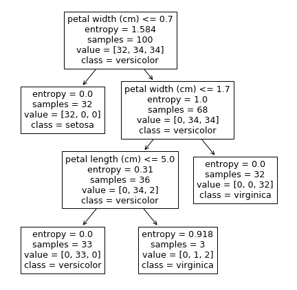
Regression
Book reference: Chapter 8.3, page 241Least square linear regression is implemented with a LinearRegression object available in the sklearn.linear_model library. In this example, we model the petal width from the Iris data as the dependent variable, and the three other features as the regressors.
from sklearn.linear_model import LinearRegression

# Target is petal width
y = iris.data[:,3]
# All the other variables are input features
X = iris.data[:,:3]
Now we fit a regression model with the fit method. The resulting predictor object is referred as reg.
# linear regression learner
reg = LinearRegression().fit(X,y)
The information regarding the regression model can be examined with various methods and attributes, such as the R-square (with the .score method)
reg.score(X,y)0.9378502736046809
as well as the regression coefficients (with the coef_ attribute) and the intercept (with the .intercept_ attribute).
reg.coef_array([-0.20726607, 0.22282854, 0.52408311])
reg.intercept_-0.24030738911225824
Finally, we are plotting the sepal length against the petal width, with the predicted regression line overlaid on observed data.
# Observed vs predicted plot
y_pred = reg.predict(X)
plt.plot(X[:,0], y, 'b.', label='observed')
plt.plot([X[:,0].min(), X[:,0].max()], [y_pred.min(), y_pred.max()],
         'r-', label='predicted')
plt.xlabel('Sepal length')
plt.ylabel('Petal width')
plt.legend()
plt.show()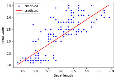
Predictors
Nearest Neighbor Classifiers
Book reference: Chapter 9.1, page 275In this example, we will construct a nearest neighbor classifier for the Iris data. First, we load the data set as before, and split it into the training (N=100) and testing (N=50) data sets.
import numpy as np
import matplotlib.pyplot as plt
from sklearn.datasets import load_iris
from sklearn.model_selection import train_test_split
from sklearn.neighbors import KNeighborsClassifier
from sklearn.metrics import confusion_matrix, classification_report

# Loading data
iris = load_iris()
X = iris.data
y = iris.target
feature_names = iris.feature_names
target_names = iris.target_names

# spliting the data into training and testing data sets
X_train, X_test, y_train, y_test = train_test_split(X, y, test_size=50,
                                                    random_state=2020)
Next, we define a nearest neighbor classification object Then we train he classifier with the fit method. available under the sklearn.neighbors library. As we define the classifier object kNN, we use the number of neighbors k=5. We use uniform weighting for the parameter weights.
kNN = KNeighborsClassifier(5, weights='uniform')Then we train he classifier with the fit method.
kNN.fit(X_train,y_train)KNeighborsClassifier(algorithm='auto', leaf_size=30, metric='minkowski',
metric_params=None, n_jobs=None, n_neighbors=5, p=2,
weights='uniform')
The trained classifier is then used to generate prediction on the testing data.
y_pred = kNN.predict(X_test)The confusion matrix and the classification report are generated.
print(confusion_matrix(y_test,y_pred))[[18 0 0] [ 0 14 2] [ 0 2 14]]
print(classification_report(y_test, y_pred, target_names=target_names)) precision recall f1-score support
setosa 1.00 1.00 1.00 18
versicolor 0.88 0.88 0.88 16
virginica 0.88 0.88 0.88 16
accuracy 0.92 50
macro avg 0.92 0.92 0.92 50
weighted avg 0.92 0.92 0.92 50
Neural Networks
Book reference: Chapter 9.2, page 282We use a multilayer perceptron (MLP) to classify species in the Iris data set. We define an MLP classifier object MLPClassifier available under the sklearn.neural_network library. As we define the classifier object mlp, we use the stochastic gradient descent solver (solver=sgd). We use 2 hidden layers 4 and 2 neurons, as defined by the parameter hidden_layer_sizes=(4, 2).
from sklearn.neural_network import MLPClassifier

mlp = MLPClassifier(solver='sgd',
                    hidden_layer_sizes=(4, 2), random_state=2020)
Then we train he network with the fit method.
mlp.fit(X_train,y_train)/home/satoru/.local/lib/python3.6/site-packages/sklearn/neural_network/_multilayer_perceptron.py:571: ConvergenceWarning: Stochastic Optimizer: Maximum iterations (200) reached and the optimization hasn't converged yet. % self.max_iter, ConvergenceWarning)
MLPClassifier(activation='relu', alpha=0.0001, batch_size='auto', beta_1=0.9,
              beta_2=0.999, early_stopping=False, epsilon=1e-08,
              hidden_layer_sizes=(4, 2), learning_rate='constant',
              learning_rate_init=0.001, max_fun=15000, max_iter=200,
              momentum=0.9, n_iter_no_change=10, nesterovs_momentum=True,
              power_t=0.5, random_state=2020, shuffle=True, solver='sgd',
              tol=0.0001, validation_fraction=0.1, verbose=False,
              warm_start=False)
The trained network is then used to generate prediction on the testing data.
y_pred = mlp.predict(X_test)The confusion matrix and the classification report are generated.
print(confusion_matrix(y_test,y_pred))[[18 0 0] [ 0 14 2] [ 0 2 14]]
print(classification_report(y_test, y_pred, target_names=target_names)) precision recall f1-score support
setosa 1.00 1.00 1.00 18
versicolor 0.88 0.88 0.88 16
virginica 0.88 0.88 0.88 16
accuracy 0.92 50
macro avg 0.92 0.92 0.92 50
weighted avg 0.92 0.92 0.92 50
Support Vector Machines
Book reference: Chapter 9.4, page 297Support vector machine (SVM) classifier and regression models are available under the sklearn.svm library as SVC and SVR, respectively. For the SVM classifier, we define a classifier object svc with the linear kernel (kernel='linear') and a somewhat soft margin (C=1.0).
from sklearn.svm import SVC, SVR

svc = SVC(kernel='linear', C=0.1)
Then we train the classifier on the training data from the Iris data set.
svc.fit(X_train,y_train)SVC(C=0.1, break_ties=False, cache_size=200, class_weight=None, coef0=0.0,
decision_function_shape='ovr', degree=3, gamma='scale', kernel='linear',
max_iter=-1, probability=False, random_state=None, shrinking=True,
tol=0.001, verbose=False)
And we use the trained model for prediction.
y_pred = svc.predict(X_test) # predicted classThe confusion matrix and the classification report are generated.
print(confusion_matrix(y_test,y_pred))[[18 0 0] [ 0 15 1] [ 0 3 13]]
print(classification_report(y_test, y_pred, target_names=target_names)) precision recall f1-score support
setosa 1.00 1.00 1.00 18
versicolor 0.83 0.94 0.88 16
virginica 0.93 0.81 0.87 16
accuracy 0.92 50
macro avg 0.92 0.92 0.92 50
weighted avg 0.92 0.92 0.92 50
For support vector regression, we try to model the petal width with all the other features. First, we define a regression model object svr with the linear kernel and a soft margin (kernel='linear' and C=0.1, respectively).
svr = SVR(kernel='linear', C=0.1)Then we train the regression model with the features and the target variable from the training data.
svr.fit(X_train[:,:3],X_train[:,3])SVR(C=0.1, cache_size=200, coef0=0.0, degree=3, epsilon=0.1, gamma='scale',
kernel='linear', max_iter=-1, shrinking=True, tol=0.001, verbose=False)
Then we calculate predicted values of the petal width based on the available features in the testing data.
y_pred = svr.predict(X_test[:,:3])We assess the performance of the model by calculating 𝑅2 statistic with the r2_score function in the sklearn.metrics library.
from sklearn.metrics import r2_score

print(r2_score(X_test[:,3], y_pred))
0.9427223321100942
We now visualize the observed and predicted target variables by a scatter plot of the sepal length against the petal width.
# plotting observed vs predicted (sepal length on x-axis)
plt.plot(X_test[:,0], X_test[:,3],'b.', label='observed')
plt.plot(X_test[:,0], y_pred, 'r.', label='predicted')
plt.xlabel(feature_names[0])
plt.ylabel(feature_names[3])
plt.legend()
plt.show()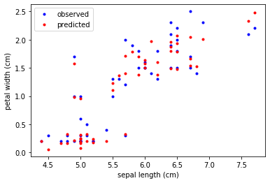
Ensemble Methods
Book reference: Chapter 9.5, page 304As an example of ensemble methods, we train a random forest classifier and use it to predict the Iris species. A random forest classifier is available as RandomForestClassifier in the sklearn.ensemble library. We define a random forest classifier object rf, with the following parameters:
- Criterion:
criterion = 'entropy' - Number of trees:
n_estimators = 100 - Minimum leaf size:
min_samples_leaf = 3 - Maximum tree depth:
max_depth = 4
from sklearn.ensemble import RandomForestClassifier

rf = RandomForestClassifier(criterion='entropy',
                            n_estimators = 100,
                            min_samples_leaf = 3,
                            max_depth = 4,
                            random_state=2020)
Then the model rf is trained with the training data.
rf.fit(X_train,y_train)RandomForestClassifier(bootstrap=True, ccp_alpha=0.0, class_weight=None,
criterion='entropy', max_depth=4, max_features='auto',
max_leaf_nodes=None, max_samples=None,
min_impurity_decrease=0.0, min_impurity_split=None,
min_samples_leaf=3, min_samples_split=2,
min_weight_fraction_leaf=0.0, n_estimators=100,
n_jobs=None, oob_score=False, random_state=2020,
verbose=0, warm_start=False)
Predictions are made on the testing data.
y_pred = rf.predict(X_test)The confusion matrix and the classification report are generated.
print(confusion_matrix(y_test,y_pred))[[18 0 0] [ 0 14 2] [ 0 3 13]]
print(classification_report(y_test, y_pred,
                            target_names=target_names))
precision recall f1-score support
setosa 1.00 1.00 1.00 18
versicolor 0.82 0.88 0.85 16
virginica 0.87 0.81 0.84 16
accuracy 0.90 50
macro avg 0.90 0.90 0.90 50
weighted avg 0.90 0.90 0.90 50